Zarby Sarmaaya
Simplifying portfolio management for investors — turning a wall of market data into a guided loop of status, risk, movement and next step.
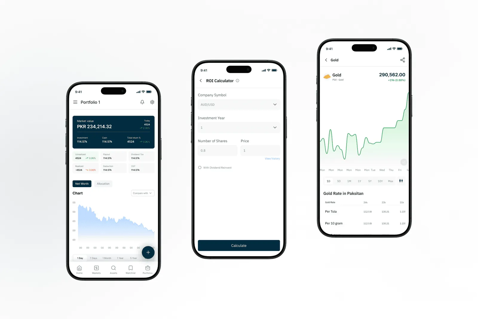
Investors had data, but not direction.
The existing experience showed holdings and market movement, but users struggled to understand what changed, what mattered, and what action to take next. The redesign reframed the app around guided portfolio clarity: status, risk, movement, and next best actions.
Create a fintech interface that feels trustworthy for new investors while still giving experienced users enough depth to act quickly.
- 01Reduce portfolio review time
- 02Make risk signals easier to interpret
- 03Give users clear next-step guidance
From scattered data points to a guided decision loop.
Research
Interviewed active and first-time investors to identify where confidence dropped during portfolio reviews.
Information design
Reorganized the dashboard around value, movement, risk, and recommended action instead of raw market modules.
Validation
Tested task flows around checking holdings, understanding a loss, and deciding whether to rebalance.
The decisions behind the interface, not just the screens.
- A clear answer to “Is my money doing okay?”
- Risk explanations that feel human, not technical
- A faster path from portfolio change to action
- Confidence that data is current and trustworthy
Redesigned user journey
Status → Why → Compare → ActCheck status
User sees whether the portfolio is stable, improving, or needs attention.
Understand why
Plain-language insight explains what caused the movement or risk change.
Compare options
Holdings, risk, and performance are grouped into decision-ready cards.
Take action
The interface recommends review, rebalance, or hold based on context.
A visual system built for trust, speed, and financial clarity.
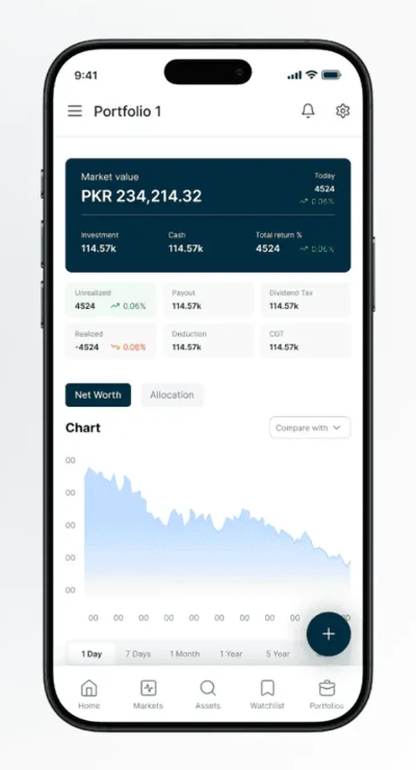
Dashboard clarity
Value, movement and holdings in a single glance — with context sitting right next to the number, so users see both the change and the reason behind it.
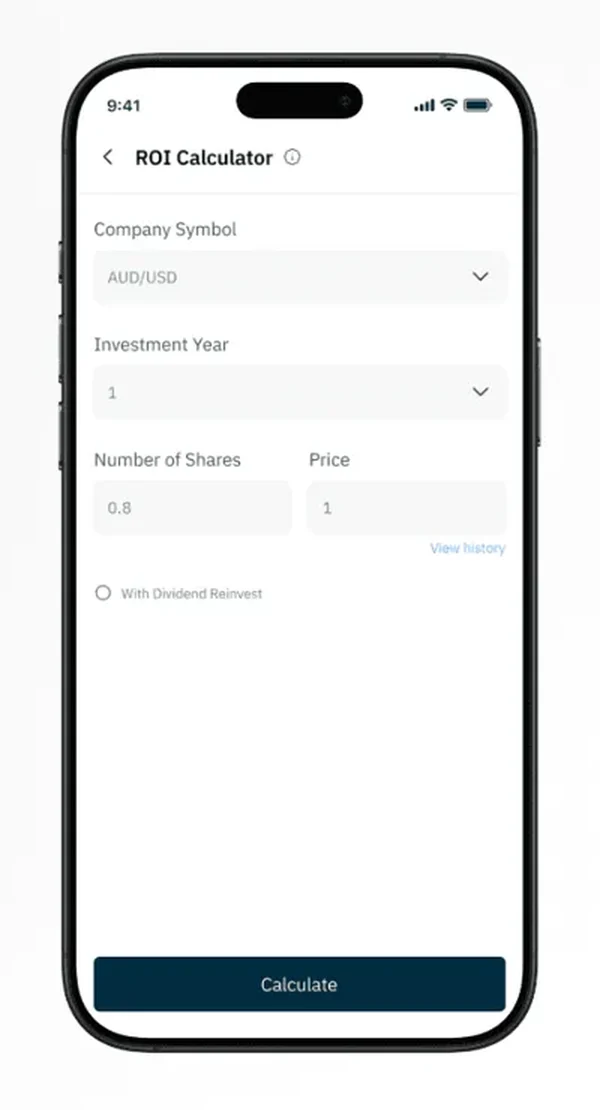
Action hierarchy
Primary actions stay close to the insight they solve. One focused form, one clear call to action — the next step is always obvious.
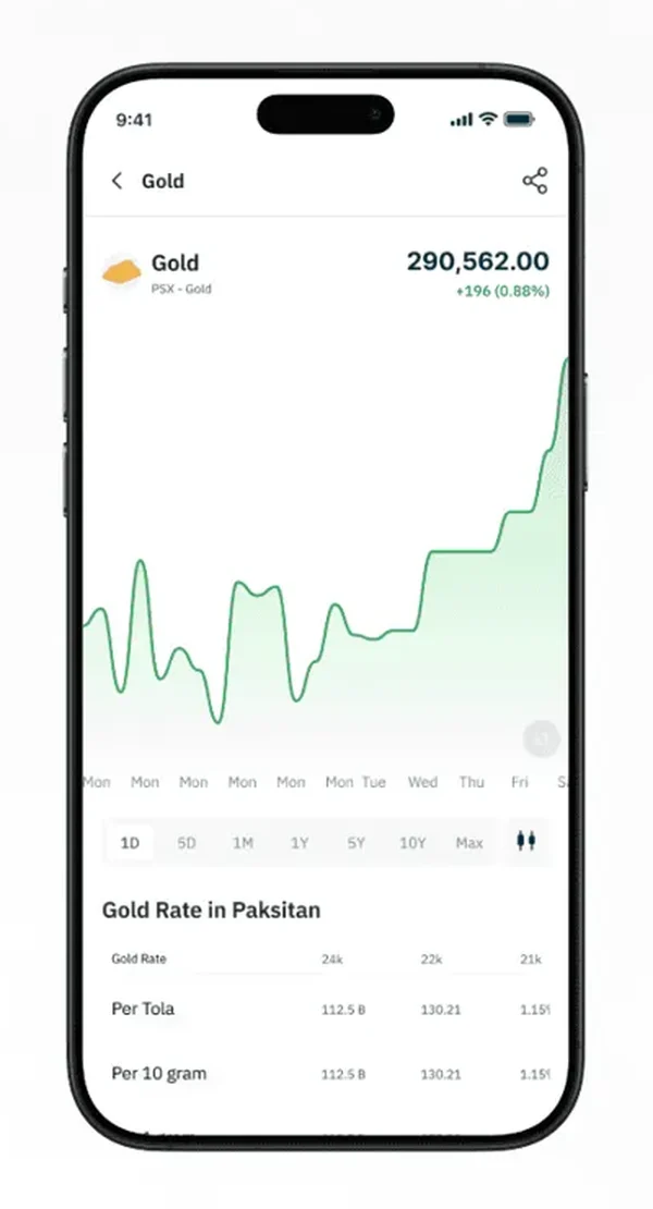
Trust language
Soft confirmations, visible sync states and plain-language explanations reduce uncertainty around live prices and rates.
Considered, usable, and ready to ship.
The final direction balances a premium fintech feel with practical usability: fewer competing modules, stronger hierarchy, clearer language, and interface patterns that help users understand their money without feeling overwhelmed.