Axontick
Giving an agentic-workflow company a website that explains a technical product in plain language — and converts on desktop and mobile alike.
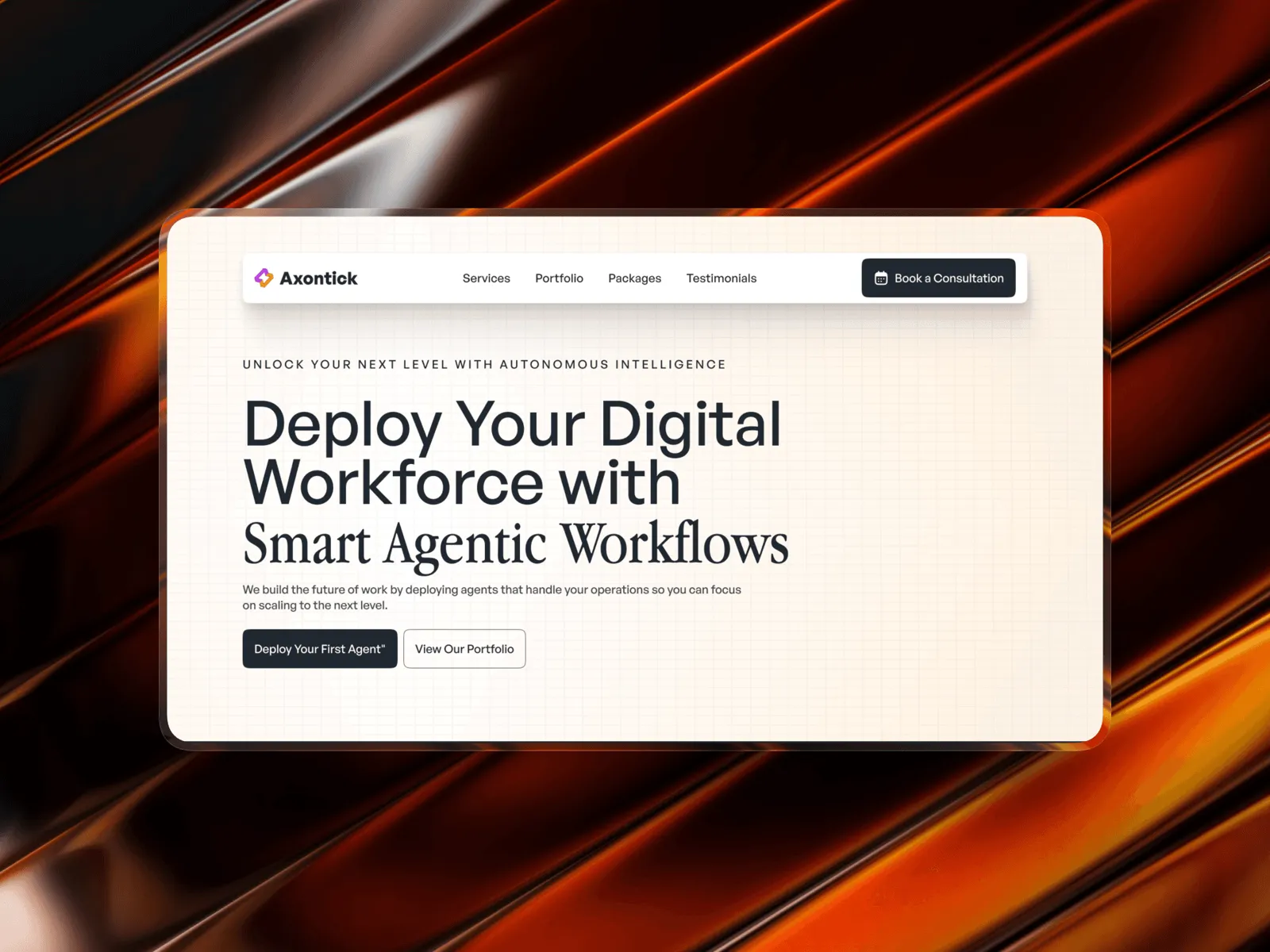
A powerful product, but a hard story to tell.
Axontick builds agentic workflow tooling — software that plans and runs multi-step tasks on a team's behalf. The idea is powerful but abstract, and the existing site buried it under jargon. The brief was a website that a non-technical visitor could understand in one scroll, without flattening what makes the product genuinely different.
Explain an agentic product simply enough for a first-time visitor, without losing the technical credibility that serious buyers look for.
- 01Make the core idea clear in the first screen
- 02Build credibility for a technical, still-early product
- 03Keep the experience fast and consistent on mobile
From feature list to a story visitors follow.
Messaging
Worked with the founders to turn technical capability into a plain- language value proposition for the hero and section headlines.
Structure
Sequenced the page as hook, explanation, proof, and conversion — so depth is available without forcing every visitor through it.
Responsiveness
Designed every section mobile-first, then layered in the desktop composition so nothing feels like an afterthought at either size.
The decisions behind the layout, not just the visuals.
- A plain answer to “what does this actually do?”
- Proof the product works, not just a description of it
- A single, obvious next step at every scroll depth
- A page that feels as considered as the product it's selling
The page's reading order
Hook → Explain → Prove → ConvertHook
A one-line promise in the hero, backed by a single, concrete visual.
Explain
How the product works, broken into three plain-language steps.
Prove
Use cases and detail sections for visitors who want more depth.
Convert
One consistent call to action, repeated at every natural exit point.
A visual system built for clarity, speed, and technical trust.
Hero section
The one-line hook
A single, concrete promise above the fold, paired with one visual instead of a wall of product screenshots.
How-it-works section
How it works
The technical process reduced to three plain-language steps, each with its own supporting visual.
Mobile layout
Mobile parity
Every section rebuilt for a single column without losing hierarchy or shortening the story.
A site that explains itself, and sells.
The final site reads clearly for a first-time visitor while still holding up under a technical buyer's scrutiny — one consistent story, one clear next step, and a responsive build that holds its composition from desktop down to a single mobile column.